


Think 360 Arts
Webpage Style Guide
This website contains the standards for all webpages that T360AL publishes.
Website Banner & Header:
Website Banner:
The website banner will prominently display “Think 360 Arts” spelled out with an image of the logo to the right of the website title. Underneath the Title of the website, sub titles can be used in a smaller font to provide context to the audience about what the website entails. The use of images are optional, but if they are used, ensure images are from T360AL programs and permissions to use have been provided.


Examples
Website Header:
The navigation menus are to be listed in the top right of the website while the T360AL logo will be in the top right corner. When the T360AL logo is clicked, it is to take the user to the website landing page. What sections are included is fluid and relates to that specific website's needs, however, it is heavily recommended that there be a contact section on all customer and donor facing websites.
An example of this can be seen on this current website, with the navigation listed in the top right and the T360AL logo appearing in the top left.
Layout:
The layout of T360AL’s websites are to appear as flowy as easy to navigate. They are to be formatted in a way that is easy to read. The page layout begins with a fixed top header containing T360AL’s logo and navigation menu, as seen on the top. Depending on the functionality of the website, the layout can either take the shape of a split screen layout or a Z-pattern layout.
The split-screen layout:
The Z-pattern layout:
The split screen layout is to be used when websites are using images frequently. This layout allows for the images to balance the text and ensure parallelism across the page when it comes to image size. This layout is most relevant for websites designed for engagement amongst our target audiences.
The Z-pattern layout is to be used when websites will not have a lot of important information, and it is more efficient for the audience to skim the page. These pages are an ideal fit when there is a clear call to action and include high levels of visualization. Z-pattern layouts are best for landing pages and light information web pages.


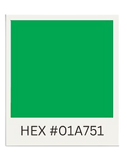
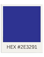
Permitted Colors
When using color on a T360AL webpage, all colors used must be from the options listed below:


Text Styles
Page Title Style
Page titles are styled using the Syne font, sized at 72px. The color used must be a non black or white color to ensure the text pops and catches the eye of the reader. All titles are to be the same color throughout the website. The alignment of these titles is to the best functionality of the website, meaning they can be left, center, or right aligned as long as they capture the attention of the reader.
Heading Styles
The H1 heading style uses a 47px size in bold, H2 uses a 38px size in semi-bold, and H3 features a 29px medium weight. All headings use the same colors to create visual hierarchy and consistency throughout the site. In other words, all H1 headings are the same color, H2 headings are the same color, and H3 headings are the same color. Headings, excluding H3, must be a non black or white color to ensure the text pops and catches the eye of the reader.
H1 Heading
H2 Heading
H3 Heading
Body Styles
The primary typeface for body text is Sans Serif Light, both offering clarity and readability. This font choice makes a clear differentiation between heading and body text. Body text is typically set at 18px and takes the color of white or black. All body text is to use paragraph formatting, but not use indenting. All body text is to be read as block text.
Often-Used Graphics
The visual graphics that will be commonly used across T360AL’s include the name and logo, the logo, as well as simple lines and arrows. Frames will often be used for images to ensure they look artfully placed on a page instead of randomized. T360AL’s web pages will also frequently have links to contact methods that have graphics laying next to them. This includes Instagram’s logo, Facebook’s logo, an email logo, and a phone logo.


Boilerplate Text
Recurring text that will appear across multiple web pages includes the T360AL Mission Statement, Vision Statement, Values Statement, and tagline.
Values
-
Equity, Diversity, Inclusion & Accessibility
-
Creativity & Delight
-
Learning & Curiosity
Mission
-
To engage Coloradans of all ages in innovative arts programming that inspires creativity, builds community, & advances equity.
Vision
-
All communities can experience the transformative benefits of arts education.
Tagline
-
We curate, plan, and schedule one-of-a-kind creative learning experiences in the classroom and community.
Navigation Footer
The footer is divided into three columns with the T360AL logo on the left. The first column provides quick access to essential pages like Home, Programs, Events, and the Donate page. The second column focuses on organizational information, offering links to the Mission page, Staff, and Career opportunities. The third column supplies up-to-date contact details, including the physical address, a phone number, and a general email address.

Keywords for Navigation
Relevant keywords for enhancing navigation and searchability include terms such as Arts Education, Teaching Artists, Community Engagement, and Nonprofit. Additional useful terms are Arts Integration, Professional Development, STEAM, and Donate.
Policy & Procedures
This section has been designed to ensure that all elements of published content, from text to design, follow a strict set of regulations to ensure parallelism across all forms of content. All items within this section are to be followed exactly and never adapted.
The purpose of this section is to ensure that all content has the same look and feel, creating a strong sense of brand recognition and ensuring users can easily learn how to access all of our content. These policies are so important to follow as disturbing them could result in user confusion, misunderstanding, or the content may seem entirely out of place and incorrect. These policies benefit you, as well. They ensure efficiency within all of our work as every form of content will be easily understandable and accessible.
This section includes policies and procedures relating to the workflow process, how files and folders are to be organized and named, how web content will be archived, our tagging and taxonomy policy, and our structured authoring policy.
Workflow Process

Folder & File Organization
To ensure all documents can be easily found, folders will follow a tree-like structure. This will begin with the folder “T360AL_Content.” Within this folder, the branches of the content platforms can be found. From there, folders will be separated by semesters and years. Inside of those folders will contain the specific projects. Projects will be split into documents and other media sorts, such as images.
File Naming
When naming folders and files, all files are to have the first letter of every word be capitalized, including typically uncapitalized letters such as “and” and “or.” We will use underscores to represent spaces between words. Dates will follow the standard US Format (MM/DD/YYYY). All numbers within the date are to be filled using zeros if the date is not a double digit. For example, 04/01/2025. If the day and month are not applicable, just the year can be used. The names of the file should match the title of the content in a brief format. For example, Style_Guide_2025. Follow the below examples for content types.
Document
Style_Guide_2025_Document
Image
Style_Guide_2025_Image
Video
Style_Guide_2025_Video
Draft
Style_Guide_2025_Draft
Web Content Archiving
To ensure all content is never lost, content will be saved to the T360AL content folder in addition to locally on the platform it is created on. Ensure all content is created under official TCID accounts and not personal or individual accounts.
In addition, content will continuously be logged in the T360AL Content Excel spreadsheet. Here, staff are to fill in the following information:
-
Content name
-
Platform(s) content is being published on
-
Direct link (to draft and final published content if applicable)
-
Status (Drafted, posted, archived, deleted)
-
Folder location
Tagging & Taxonomy
To ensure our audience is easily able to find where content is located, all content is to follow the tagging and taxonomy policy.
-
Hashtags are to be broad to ensure all media connect to one another.
-
If creating content related to a special event, include two hashtags: one with the name of the event, and one with the name of the event and the year.
-
Across all content, always use the following hashtags:
-
#think360arts #t360al #art #denver #colorado #education #arteducation #artlearning #artprograms #creatives
-
-
For internally produced elements, use the following formula: projectdescription_year_contenttype
-
Ex. SummerCamp_2025_Video.mp4
-
Structured Authoring
At Think 360 Arts for Learning, we keep things consistent by using the same names, phrases, and hashtags across all content. Always use the full organization name and our tagline, “We curate, plan, and schedule one-of-a-kind creative learning experiences in the classroom and community.,” where it makes sense. Stick to the official names for programs like Creative Aging and Artist Residencies, and for events like Arts Month and Youth Voice Summit, just use the acronym after the first mention if needed (such as Youth Voice Summit (YVS)). When posting online, use the required hashtags found above. Keeping our language structured helps everyone stay on the same page and makes our content easier to find and reuse.
In Conclusion
Consistency is what keeps our content organized, searchable, and easy to manage long-term. By sticking to these policies involving archiving content on time, using clear tags, and keeping our language consistent, we make life easier for our team and help build a stronger, more recognizable voice for Think 360 Arts.
In the future, this approach will make it simpler for new staff and partners to find what they need, reuse content, and keep our storytelling smooth and unified, even as tools and people change.